这篇笔记一共有三章,第一章记录 crosstalk 与绘图包结合的案例,第二章记录 crosstalk 与表格包结合的案例,第三章记录一些 crosstalk 包本身可改动的参数细节。
crosstalk 包是 Rstudio 他们家提供的一个 html 小部件,此包可以和图形或表格结合起来应用,主要提供刷选和过滤功能。包的文档仅有13页,有网站案例,最近更新于2021年11月4日。讲真 crosstalk 包真就只是一个功能有限的小部件,有很多绘图包和表格包本身就提供刷选和过滤功能,而且能与 crosstalk 包联合使用的包也不多。但此包可以写上许多个刷选和过滤条件,其最大的优点是小巧灵活,好用呐。
一、与绘图包结合 🔗
1.1. 自带刷选和过滤功能的交互式绘图包 🔗
这一节的案例都很简洁,各家的官方文档都写得很详细,笔者就不费时间多鼓捣了,以后要是需要用到,自然会再花时间仔细学习的。不知是不是因为写了 echarts4r 的笔记后对可视化图形中的基本要素都摸熟了,再看这几个包的文档会觉得学习起来应该会很快,比如看 scatterD3 包的文档时虽然有些单词不太认识,但是基本上看参数名称就能大致猜到那是用来修改什么细节的。
另外,在梳理这一小节内容的时候,顺便看了一些介绍这些包的文章,也使得俺明白了一个道理。之前在统计之都论坛上曾有一个小伙伴吐槽说 echarts4r 不能像 ggplot2 那样分层因而感到遗憾。可是 echarts4r 本身就是被设计成一个可以快速画出交互图形的包,而快速的前提就是如果要在一个大的图形区域中同时绘制多个图形,那么这些图形的图例、视觉映射等组件就是共享的,也正是因为“共享”而不能像 ggplt2 那样分层,但是这并不影响在这些限制条件下使用 echarts4r。
令俺感到比较惊喜的一个发现是,plotly 包竟然提供了一个ggplotly()函数可以直接把 ggplot2 包画出来的静态图转换成动态图,真是一个强大又可爱的函数呀。
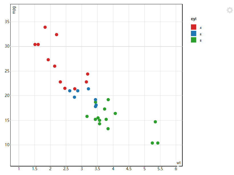
1.1.1. scatterD3 🔗
官方文档:https://cran.r-project.org/web/packages/scatterD3/vignettes/introduction.html。
scatterD3 包的scatterD3()函数不需要多的设置,本身自带筛选和过滤功能,将鼠标放置到中间的图形区域中滚动鼠标的滚轮便可看见图形在自动地放大或缩小,而将鼠标放到右侧图例中的其中一个上面的时候,图形中展示的散点范围也会自动改变。
#install.packages("./scatterD3_1.0.1.tar.gz",repo=NULL,type="source")
library(scatterD3)

mtcars$cyl <- as.factor(mtcars$cyl)
scatterD3(mtcars,
          x = wt,
          y = mpg,
          col_var = cyl)
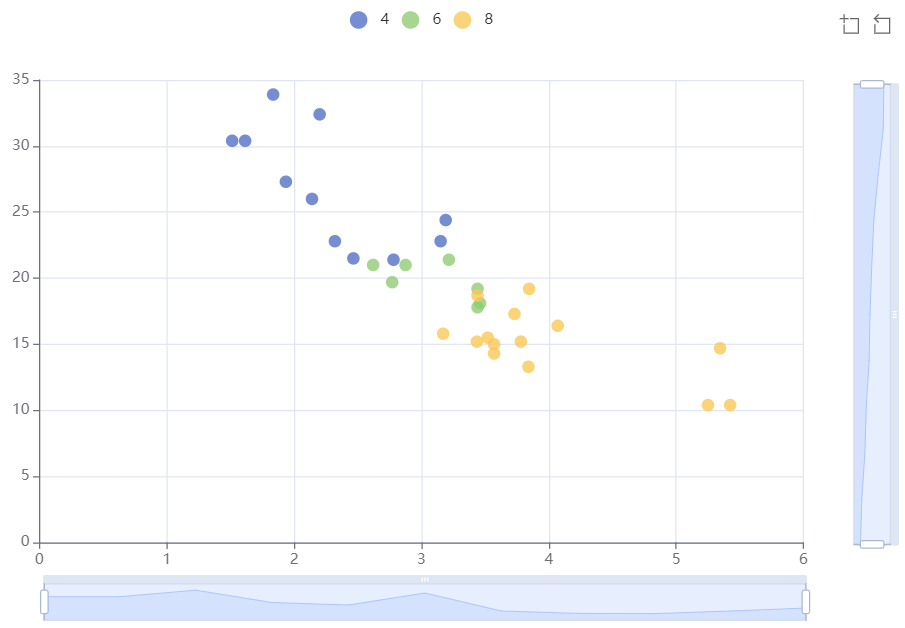
1.1.2. echarts4r 🔗
官方文档:https://echarts4r.john-coene.com/articles/chart_types.html。
使用 echarts4r 包时若要增加刷选功能需写入e_datazoom()或e_brush(),图例过滤的功能和 scatterD3 包类似。
library(echarts4r)

mtcars$cyl<-as.factor(mtcars$cyl)

mtcars |>
  group_by(cyl) |> # 分组
  e_charts(wt) |>
  e_scatter(serie = mpg, symbol_size = 10) |>
  e_datazoom(x_index = 0) |> # 增加主X轴的刷选
  e_datazoom(y_inde = 0) # 增加主Y轴的刷选
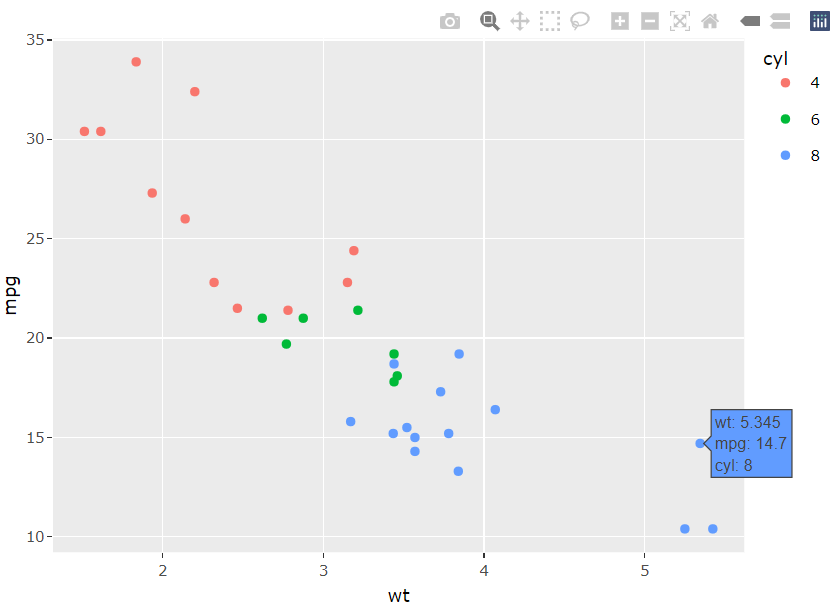
1.1.3. ggplot2 结合 plotly::ggplotly() 🔗
官方文档:https://plotly-r.com/improving-ggplotly.html、https://plotly.com/ggplot2/getting-started/。
转换之后的动态图自带许多细节。
library(plotly)
library(ggplot2)

mtcars$cyl <- as.factor(mtcars$cyl)

p <-
  ggplot(data = mtcars, aes(x = wt, y = mpg, color = cyl)) + geom_point()
plotly::ggplotly(p)
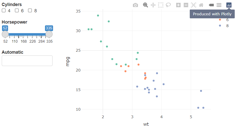
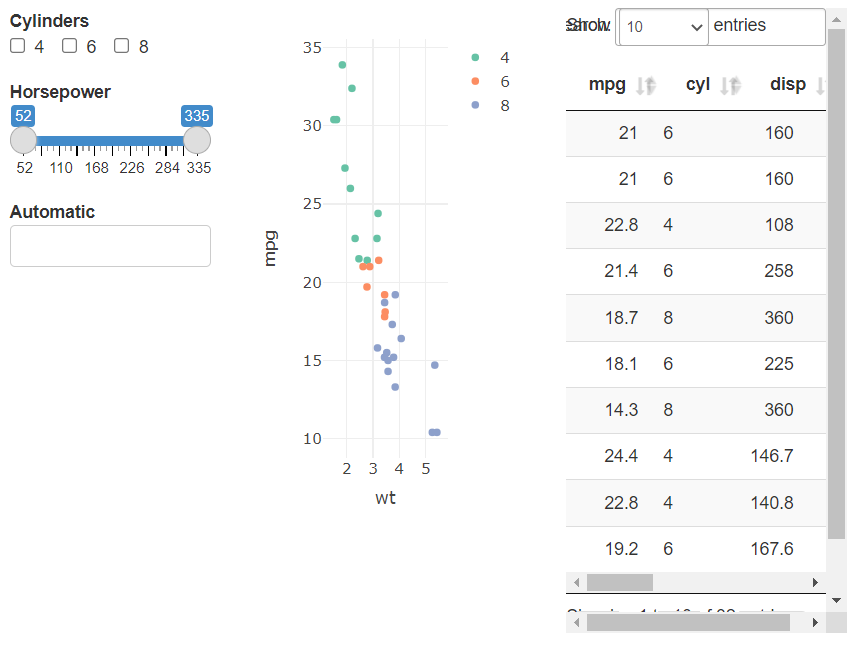
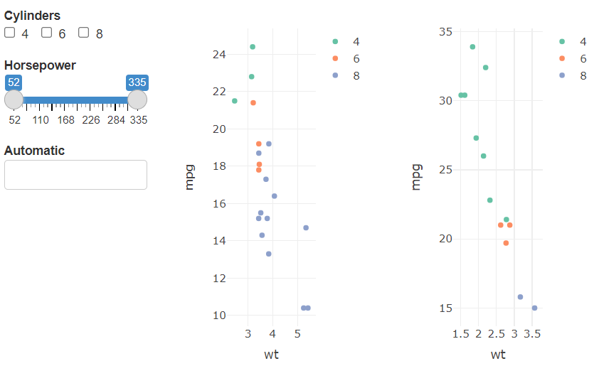
1.2. 与 plotly 结合 🔗
官方文档:https://plotly.com/r/。
library(crosstalk)

mtcars$cyl<-as.factor(mtcars$cyl)

shared_mtcars <- SharedData$new(mtcars)
bscols(
  widths = c(3, NA),
  list(
    filter_checkbox("cyl", "Cylinders", shared_mtcars, ~ cyl, inline = TRUE),
    filter_slider("hp", "Horsepower", shared_mtcars, ~ hp, width = "100%"),
    filter_select("auto", "Automatic", shared_mtcars, ~ ifelse(am == 0, "Yes", "No"))
  ),
  plot_ly(
    data = shared_mtcars,
    x =  ~ wt,
    y =  ~ mpg,
    color =  ~ cyl
  )
)
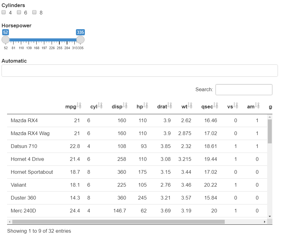
二、 与表格包结合 🔗
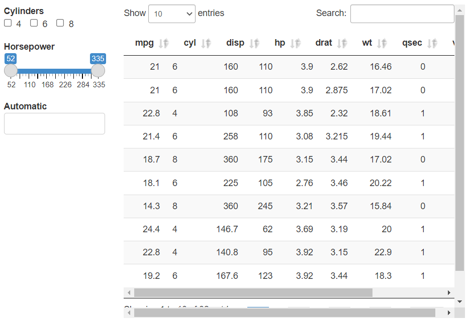
2.1. 与 DT 包结合 🔗
官方文档:https://rstudio.github.io/DT/。
library(DT)

shared_mtcars <- SharedData$new(mtcars)
bscols(
  widths = c(3, 9),
  list(
    filter_checkbox("cyl", "Cylinders", shared_mtcars, ~ cyl, inline = TRUE),
    filter_slider("hp", "Horsepower", shared_mtcars, ~ hp, width = "100%"),
    filter_select("auto", "Automatic", shared_mtcars, ~ ifelse(am == 0, "Yes", "No"))
  ),
  DT::datatable(
    shared_mtcars,
    editable = 'cell',
    width  = '100%',
    rownames = FALSE,
    options = list(pageLength = 10,
                   scrollY = FALSE #关闭默认滚动模式
                   )))
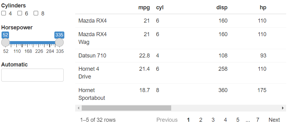
2.2. 与 reactable 包结合 🔗
官方文档:https://glin.github.io/reactable/articles/examples.html#cross-widget-interactions。
library(reactable)

shared_mtcars <- SharedData$new(mtcars)
bscols(
  widths = c(3, 9),
  list(
    filter_checkbox("cyl", "Cylinders", shared_mtcars, ~ cyl, inline = TRUE),
    filter_slider("hp", "Horsepower", shared_mtcars, ~ hp, width = "100%"),
    filter_select("auto", "Automatic", shared_mtcars, ~ ifelse(am == 0, "Yes", "No"))
  ),
  reactable(shared_mtcars, defaultPageSize = 5)
)
三、参数细节 🔗
要做细节修正直接看官方文档就好,实在是没有几个想要鼓捣到笔记里面的说。
3.1. 数据共享 🔗
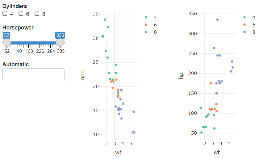
crosstalk 包可使放到bscols()中的多个数据图表联动刷选和过滤,改动刷选项,图或表中所展示内容会一起改变。
- 放多个 plotly 的图
shared_mtcars <- SharedData$new(mtcars)
bscols(
  widths = c(3, NA, NA),
  list(
    filter_checkbox("cyl", "Cylinders", shared_mtcars, ~ cyl, inline = TRUE),
    filter_slider("hp", "Horsepower", shared_mtcars, ~ hp, width = "100%"),
    filter_select("auto", "Automatic", shared_mtcars, ~ ifelse(am == 0, "Yes", "No"))
  ),
  plot_ly(
    data = shared_mtcars,
    x =  ~ wt,
    y =  ~ mpg,
    color =  ~ cyl
  ),
  plot_ly(
    data = shared_mtcars,
    x =  ~ wt,
    y =  ~ hp,
    color =  ~ cyl
  )
)
- 放多个图和表
shared_mtcars <-
  SharedData$new(mtcars)
bscols(
  widths = c(3, NA, NA),
  list(
    filter_checkbox("cyl", "Cylinders", shared_mtcars, ~ cyl, inline = TRUE),
    filter_slider("hp", "Horsepower", shared_mtcars, ~ hp, width = "100%"),
    filter_select("auto", "Automatic", shared_mtcars, ~ ifelse(am == 0, "Yes", "No"))
  ),
  plot_ly(
    data = shared_mtcars,
    x =  ~ wt,
    y =  ~ mpg,
    color =  ~ cyl
  ),
  DT::datatable(
    shared_mtcars,
    editable = 'cell',
    width = '100%',
    rownames = FALSE,
    options = list(pageLength = 10,
                   scrollY = FALSE #关闭默认滚动模式
                   )))
3.2. 分组 🔗
若是希望同一区域中两组不同的数据仍然可以联动刷选,那么需要如此设定SharedData$new(, group = "mtcars_subset"),即group = ''中的内容一致。这样即使范围不同,但有相同字段的数据也可以联动刷选
# 全量数据,用于设置刷选项
sd_mtcars_all <- SharedData$new(mtcars, group = "mtcars_subset")
# 第一份数据
sd_mtcars_auto <-
  SharedData$new(mtcars[mtcars$am == 0, ], group = "mtcars_subset")
# 第二份数据
sd_mtcars_manual <-
  SharedData$new(mtcars[mtcars$am == 1, ], group = "mtcars_subset")

bscols(
  widths = c(3, NA, NA),
  list(
    filter_checkbox("cyl", "Cylinders", sd_mtcars_all, ~ cyl, inline = TRUE),
    filter_slider("hp", "Horsepower", sd_mtcars_all, ~ hp, width = "100%"),
    filter_select("auto", "Automatic", sd_mtcars_all, ~ ifelse(am == 0, "Yes", "No"))
  ),
  plot_ly(
    data = sd_mtcars_auto, # 引入第一份数据
    x =  ~ wt,
    y =  ~ mpg,
    color =  ~ cyl
  ),
  plot_ly(
    data = sd_mtcars_manual, # 引入第二份数据
    x =  ~ wt,
    y =  ~ mpg,
    color =  ~ cyl
  )
)
3.3. 位置 🔗
把filter_checkbox()等挪到bscols()外面去,这几个筛选项的位置也会自动挪到表格的上方。
shared_mtcars <- SharedData$new(mtcars)

filter_checkbox("cyl", "Cylinders", shared_mtcars, ~ cyl, inline = TRUE)
filter_slider("hp", "Horsepower", shared_mtcars, ~ hp, width = "30%")
filter_select("auto", "Automatic", shared_mtcars, ~ ifelse(am == 0, "Yes", "No"))

bscols(
  DT::datatable(
    shared_mtcars,
    extensions = "Scroller",
    style = "bootstrap",
    class = "compact",
    width = "100%",
    options = list(
      deferRender = TRUE,
      scrollY = 300,
      scroller = TRUE
    )
  )
)
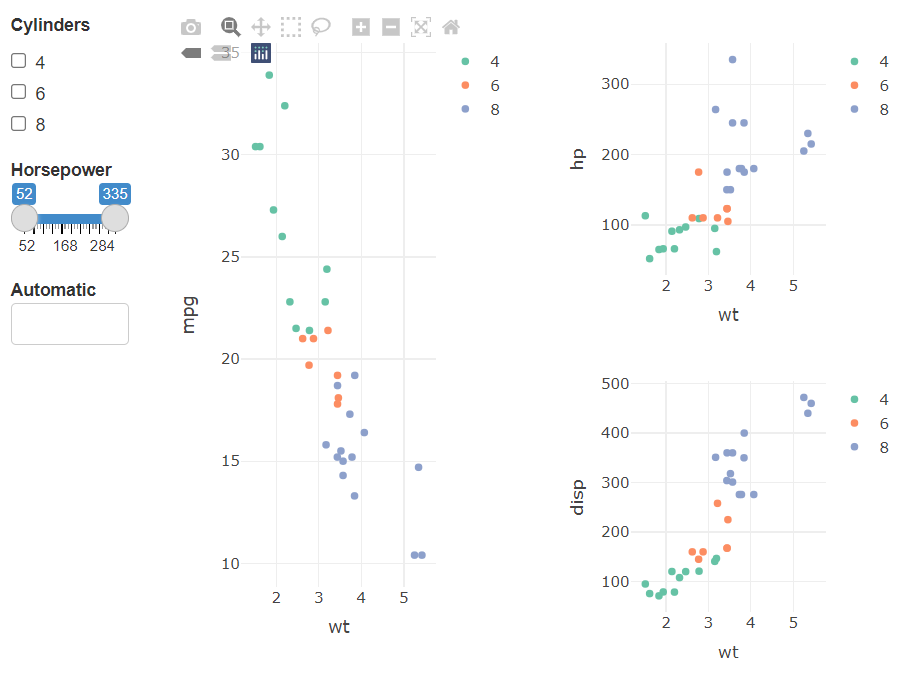
3.4. 布局 🔗
如bscols(widths = c(2, NA, NA), list( ), list( ), list( ))中三个list()就是把整个展示区域竖着分成三份。而widths = c()中的三个值就对应三个list()所占的宽度,里面的三个值都填上的话需要加起来等于12,如widths = c(2, NA, NA)表示第一份站2格,剩下两份均分剩下的区域。每个list()里面还可以写多个图或表来展示,但前提条件是需要调整每个图或表的高度和宽度。
shared_mtcars <- SharedData$new(mtcars)
bscols(
  widths = c(2, NA, NA),
  list(
    filter_checkbox("cyl", "Cylinders", shared_mtcars, ~ cyl, inline = FALSE),
    filter_slider("hp", "Horsepower", shared_mtcars, ~ hp, width = "100%"),
    filter_select("auto", "Automatic", shared_mtcars, ~ ifelse(am == 0, "Yes", "No"))
  ),
  plot_ly(
    data = shared_mtcars,
    x =  ~ wt,
    y =  ~ mpg,
    color =  ~ cyl,
    height = 500
  ),
  list(
    plot_ly(
      data = shared_mtcars,
      x =  ~ wt,
      y =  ~ hp,
      color =  ~ cyl,
      height = 250
    ),
    plot_ly(
      data = shared_mtcars,
      x =  ~ wt,
      y =  ~ disp,
      color =  ~ cyl,
      height = 250
    )
  )
)
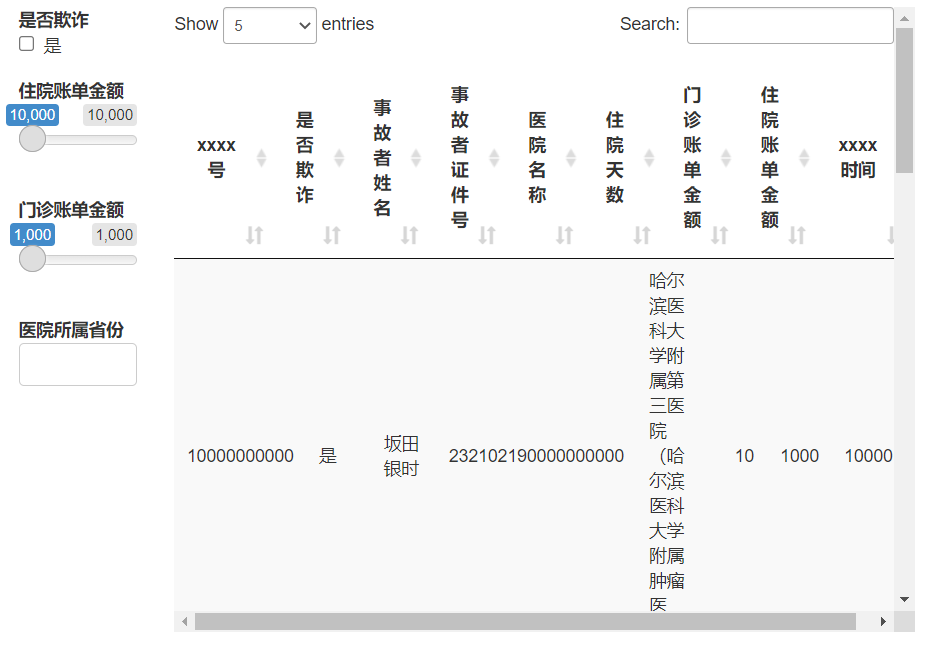
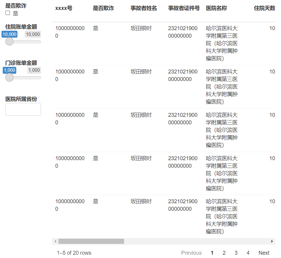
四、 奇形怪状的数据 🔗
那些表格包的官网在展示功能时往往使用的都是如mtcars、iris等比较标准的数据集,但真实应用场景下的数据往往长得奇形怪状的。比如下面这样的。
table1 <- data.frame(
  "xxxx号" = rep('10000000000', 20),
  "是否欺诈" = rep('是', 20),
  "事故者姓名" = rep('坂田银时', 20),
  "事故者证件号" = rep('232102190000000000', 20),
  "医院名称" = rep('哈尔滨医科大学附属第三医院(哈尔滨医科大学附属肿瘤医院)', 20),
  "住院天数" = rep(10, 20),
  "门诊账单金额" = rep(1000, 20),
  "住院账单金额" = rep(10000, 20),
  "xxxx时间" = rep('2019/4/4', 20),
  "xxxxx时间" = rep('2019/4/16 13:55:55', 20),
  "医院所属省份" = rep('黑龙江省', 20),
  "医院所属城市" = rep('哈尔滨市', 20),
  "啊啊啊啊啊" = rep('啊啊啊', 20),
  "哦哦哦哦哦" = rep('哦哦哦哦哦哦哦哦哦', 20),
  "嗷嗷嗷嗷嗷嗷" = rep('嗷嗷嗷嗷嗷嗷', 20),
  "嗯嗯嗯嗯嗯嗯嗯" = rep('嗯嗯嗯', 20),
  "鹅鹅鹅鹅鹅" = rep('鹅鹅鹅鹅鹅', 20),
  "icd10代码" = rep('S60', 20),
  "icd10名称" = rep('腕和手浅表损伤,未特指', 20)
)
4.1. 用 DT 包 🔗
笔者在探索过程中遇到 crosstalk 的复选框超过屏幕以外的情况,上统计之都发帖提问后得到答案如下。
```{css, echo=FALSE}
/*在使用 crosstalk 时*/
/*去除边距设置 */
.container-fluid.crosstalk-bscols {
  margin-left: inherit;
  margin-right: inherit;
}

/*设置水平方向超宽时使用滚动条*/
.datatables.html-widget {
  overflow-x: auto;
}
```
但是遇上奇形数据还是会看起来怪怪的。
shared_table1 <- SharedData$new(table1)
bscols(
  widths = c(2, 10),
  list(
    filter_checkbox("是否欺诈", "是否欺诈", shared_table1, ~ `是否欺诈`, inline = TRUE),
    filter_slider("住院账单金额", "住院账单金额", shared_table1, ~ `住院账单金额`, width = "100%"),
    filter_slider("门诊账单金额", "门诊账单金额", shared_table1, ~ `门诊账单金额`, width = "100%"),
    filter_select("医院所属省份", "医院所属省份", shared_table1, ~ `医院所属省份`)
  ),
  DT::datatable(
    shared_table1,
    editable = 'cell',
    width = '100%',
    fillContainer = FALSE,
    rownames = FALSE,
    options = list(pageLength = 5,
                   scrollY = FALSE #关闭默认滚动模式
                   )))
4.2. 用 reactable 包 🔗
shared_table1 <- SharedData$new(table1)
bscols(
  widths = c(2, 10),
  list(
    filter_checkbox("是否欺诈", "是否欺诈", shared_table1, ~ `是否欺诈`, inline = TRUE),
    filter_slider("住院账单金额", "住院账单金额", shared_table1, ~ `住院账单金额`, width = "100%"),
    filter_slider("门诊账单金额", "门诊账单金额", shared_table1, ~ `门诊账单金额`, width = "100%"),
    filter_select("医院所属省份", "医院所属省份", shared_table1, ~ `医院所属省份`)
  ),
  reactable(shared_table1, defaultPageSize = 5)
)
两者对比发现,DT 包的表头傻乎乎地不会换行……总而言之,使用时都得仔细调整。